Every code sample on this page is pulled straight from the doc site's compiled source, and every image below it was produced by running that exact sample through Ashcroft — there are no screenshots here, only live output.
Important
On Linux / Docker / CI, SkiaSharp needs its native binaries explicitly:
dotnet add package SkiaSharp.NativeAssets.Linux.NoDependencies. Windows and macOS get them in
the box. This is the #1 support question for every Skia-based library.
The whole pitch
Five lines to a good-looking 1200×630 PNG. A built-in gradient, a centered title, all defaults:
return SocialCard.Create()
    .Background(Backgrounds.LinearGradient("#0f172a", "#1e3a8a"))
    .At(Anchor.Center, s => s.Title("April Release Notes"));
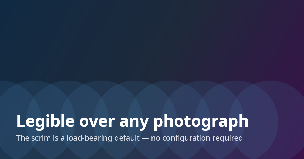
Backgrounds and the scrim
A background can be a color, a built-in gradient, an image (cover-fit and center-cropped), or a
lambda over the raw SKCanvas. When an anchored group contains text and the background is a
photo or a lambda, Ashcroft draws a subtle dark scrim behind that region — fading from ~55%
black at the nearest edge to transparent toward the center. This single default is most of why
zero-config output looks deliberate. Watch the bottom of the card darken:
return SocialCard.Create()
    .Background("assets/hero.png")
    .At(Anchor.BottomLeft, s => s
        .Title("Legible over any photograph")
        .Subtitle("The scrim is a load-bearing default — no configuration required"));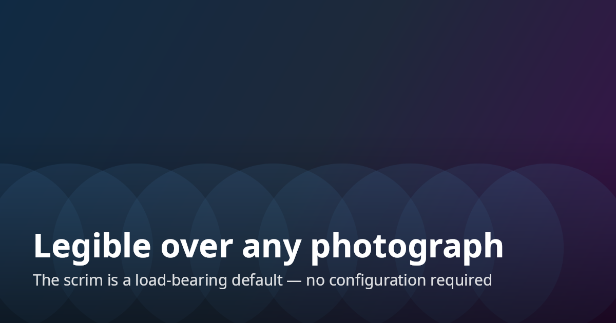
To see what that default buys you, here is the same card with and without it — opt out with
.NoScrim(), or pin a specific strength with .Scrim(0.7f):
Anchors, stacks, and elements
Content is a stack pinned to one of nine anchors; alignment is inherited from the anchor. Stacks
hold role-based elements — Title, Subtitle, Meta — plus Image, Spacer, and a Row for the
avatar-and-byline pattern. The roles encode a tested type scale and opacity ramp, so you describe
what the text is, not what it looks like. Here's the expected common case, a blog card:
return SocialCard.Create()
    .Background("assets/hero.png")
    .At(Anchor.TopRight, s => s.Image("assets/logo.png", height: 48))
    .At(Anchor.BottomLeft, s => s
        .Title("Why Your OG Images Look Like Everyone Else's")
        .Subtitle("What HarfBuzz actually does, and why you want it")
        .Spacer(8)
        .Row(r => r
            .Image("assets/avatar.png", height: 44, shape: ImageShape.Circle)
            .Meta("Phil Scott · June 2026")));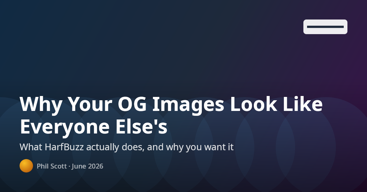
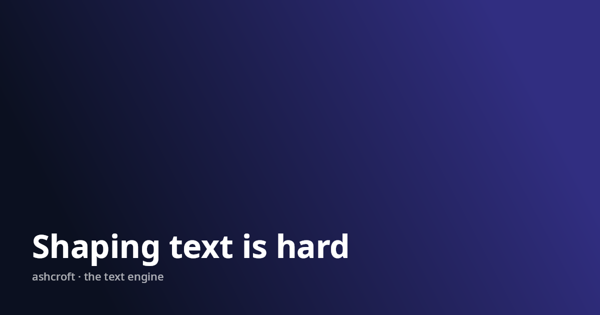
The text engine
Every string is shaped by HarfBuzz and wrapped on shaped-cluster boundaries — measurement and
drawing share the same glyphs, so nothing ever clips mid-character. The payoff shows up when a
title refuses to fit: a Title wraps up to three lines, then steps its size down toward a 70%
floor, and only then ellipsizes. It never throws and never overflows the card:
return SocialCard.Create()
    .Background(Backgrounds.LinearGradient("#312e81", "#0b1020"))
    .At(Anchor.BottomLeft, s => s
        .Title("Everything I learned shipping a cross-platform text rendering pipeline " +
               "built on SkiaSharp, HarfBuzz, and an unreasonable number of glyph metrics, " +
               "and what I would do differently if I had to start over today")
        .Meta("ashcroft · the text engine"));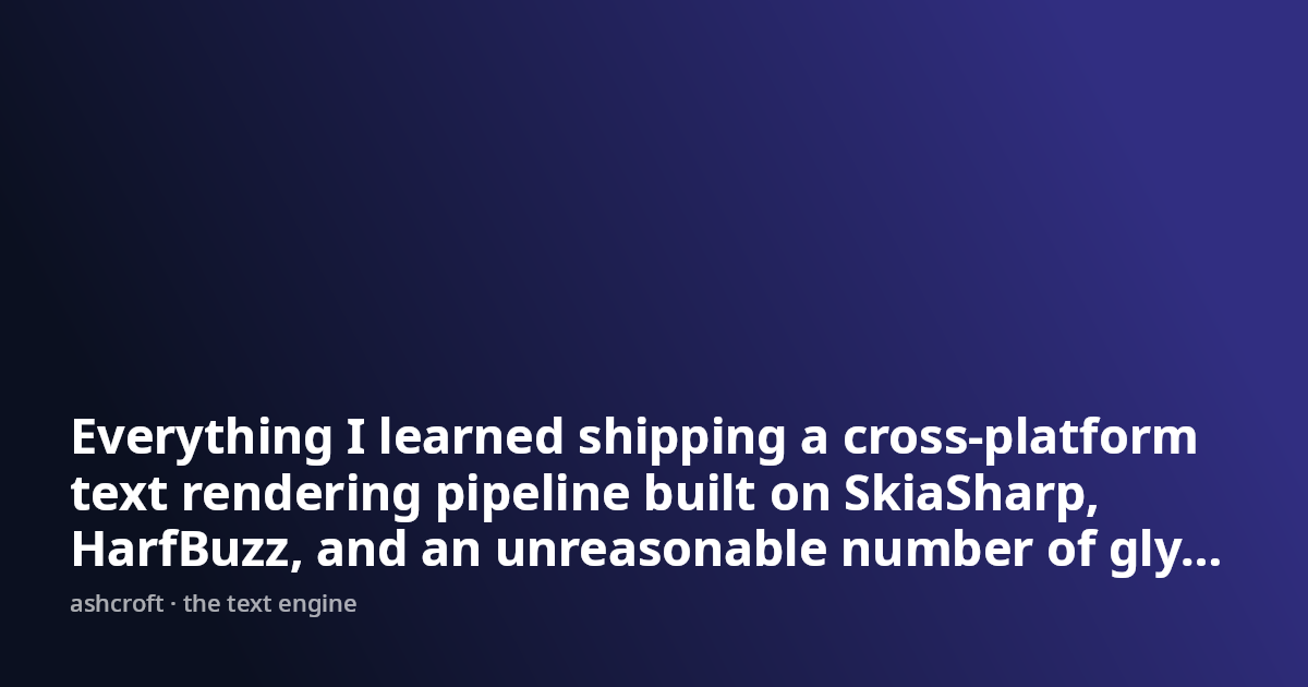
The same layout with a title of each length — no code changes between them:
Shaping is also per run: when the primary face can't cover a codepoint, Ashcroft finds a system face that can — emoji and CJK in one string need zero configuration:
return SocialCard.Create()
    .Background(Backgrounds.LinearGradient("#7c2d12", "#0c0a09"))
    .At(Anchor.Center, s => s
        .Title("Shipping 🚀 to 東京")
        .Subtitle("Emoji and CJK fall back per run — they just work"));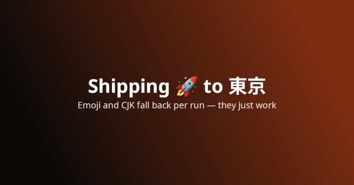
Generative backgrounds
Need something we didn't anticipate? Draw it yourself — Background takes a
(canvas, size) lambda over the raw Skia surface, and the role text still sits on top with its
defaults intact:
return SocialCard.Create(CardSize.Square)
    .Theme(new Theme { TextColor = "#a7f3d0" })
    .Background(DrawIsoGrid)
    .At(Anchor.Center, s => s
        .Title("ashcroft v1.0", size: 88)
        .Meta("social cards for .NET"));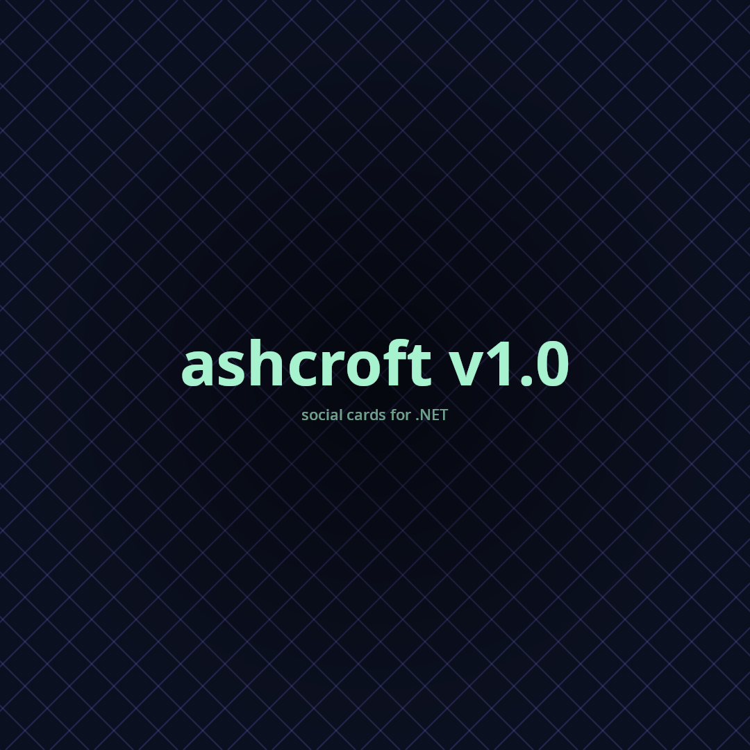
Theming
Card-wide changes go through a Theme — font family, text color, and a scale multiplier over the
whole type ramp. One-off overrides ride on optional parameters per element. Colors are hex strings
everywhere, so casual users never construct an SKColor:
return SocialCard.Create()
    .Theme(new Theme { TextColor = "#a7f3d0" })
    .Background(Backgrounds.RadialGradient("#0b1020", "#020617"))
    .At(Anchor.BottomLeft, s => s
        .Title("Designed by default")
        .Subtitle("Describe what the text is, not what it looks like")
        .Meta("dotnet add package Ashcroft"));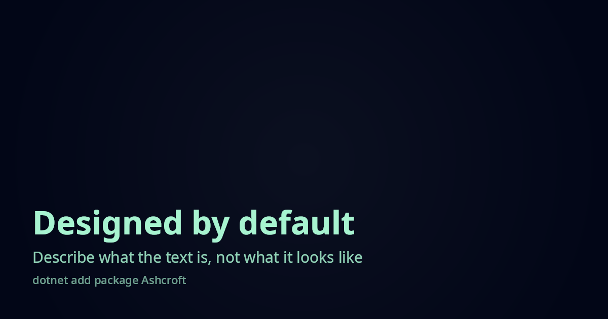
Coloring individual elements
When the theme is right but one element isn't, every role takes an optional color: and size: —
overrides are opt-in, not all-or-nothing. And when the roles themselves aren't enough, Text()
takes a full TextStyle (size, weight, letter-spacing, line height); its color is used exactly as
given, with no role opacity ramp applied. Here the kicker is a custom Text(), the title stays on
the theme default, and the subtitle and meta are tinted:
return SocialCard.Create()
    .Background(Backgrounds.RadialGradient("#1e1b4b", "#0b1020"))
    .At(Anchor.BottomLeft, s => s
        .Text("CASE STUDY", new TextStyle { Size = 22, Weight = 600, LetterSpacing = 4, Color = "#fbbf24" })
        .Title("Coloring outside the theme")
        .Subtitle("Every role takes an optional color and size", color: "#93c5fd")
        .Meta("ashcroft.dev", color: "#fbbf24"));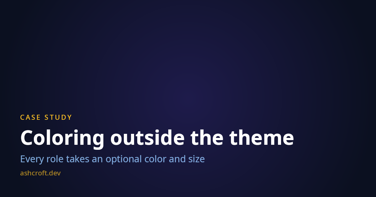
Custom fonts
Two ways in. Theme.FontFamily asks for an installed font by name and falls back silently down a
chain (requested → Segoe UI → Helvetica Neue → platform sans) — hook AshcroftDiagnostics.Log to
hear about it. Theme.FontPath skips resolution entirely and loads a TTF/OTF you ship with your
app, which is the reproducible choice for CI and containers. One file is one face — it carries
every weight on the card, so pick a face that reads well everywhere it'll land:
return SocialCard.Create()
    .Theme(new Theme { FontPath = "assets/SpaceGrotesk-Bold.ttf" })
    .Background(Backgrounds.LinearGradient("#134e4a", "#0f172a"))
    .At(Anchor.Center, s => s
        .Title("Bring your own typeface")
        .Meta("Theme.FontPath · any TTF or OTF"));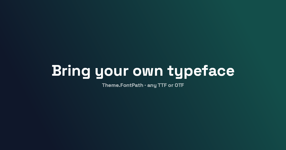
Fine-tuning the layout
The defaults — 64px padding, 12px gap, text wrapping at the card width — are tuned for the common
case, and each has an override: Padding on the card; MaxWidth, Gap, and Align on a stack;
Spacer for a one-off gap between two elements. Images clip to Rounded (with a corner radius)
or Circle. Here a capped text column shares the card with a rounded image on the opposite edge:
return SocialCard.Create()
    .Padding(80)
    .Background("#0b1020")
    .At(Anchor.MiddleLeft, s => s
        .MaxWidth(560)
        .Gap(20)
        .Title("Every default has an override")
        .Subtitle("Padding, MaxWidth, Gap, Align — when the defaults aren't enough"))
    .At(Anchor.MiddleRight, s => s
        .Image("assets/hero.png", width: 360, shape: ImageShape.Rounded, cornerRadius: 24));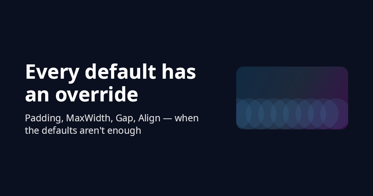
Output
Rendering is deferred — nothing rasterizes until you ask for bytes:
card.Save("og.png");                       // format inferred from the extension
card.Save(stream, ImageFormat.Png);
byte[] bytes = card.ToBytes(ImageFormat.Webp, quality: 90);
using SKImage img = card.ToImage();        // escape hatch for further Skia work
.Scale(2) renders at 2× pixel density with all layout values multiplied — crisp on high-DPI
surfaces. PNG is the default and the recommendation for OG images.